Ahh, it’s time for some more spring trends. This time, we’re tackling something a bit more tangible for your wardrobe: colors. First came butter yellow, then cobalt blue–proof that color trends move fast, and keeping up can feel like a full-time job. Luckily, it’s ours! After months spent combing through fall and spring collections, InStyle editors have done the legwork for you.
While rich espressos and deep burgundies defined the colder months, spring signals a shift toward something lighter, brighter, and a little more playful. From canary yellow and powder pink to vivid royal purple, the runways delivered a spectrum of standout shades this circuit. Whether you’re leaning into dresses, statement accessories, or an updated rotation of flats, consider this your cue to step outside the all-black uniform (guilty) and embrace something more whimsical.
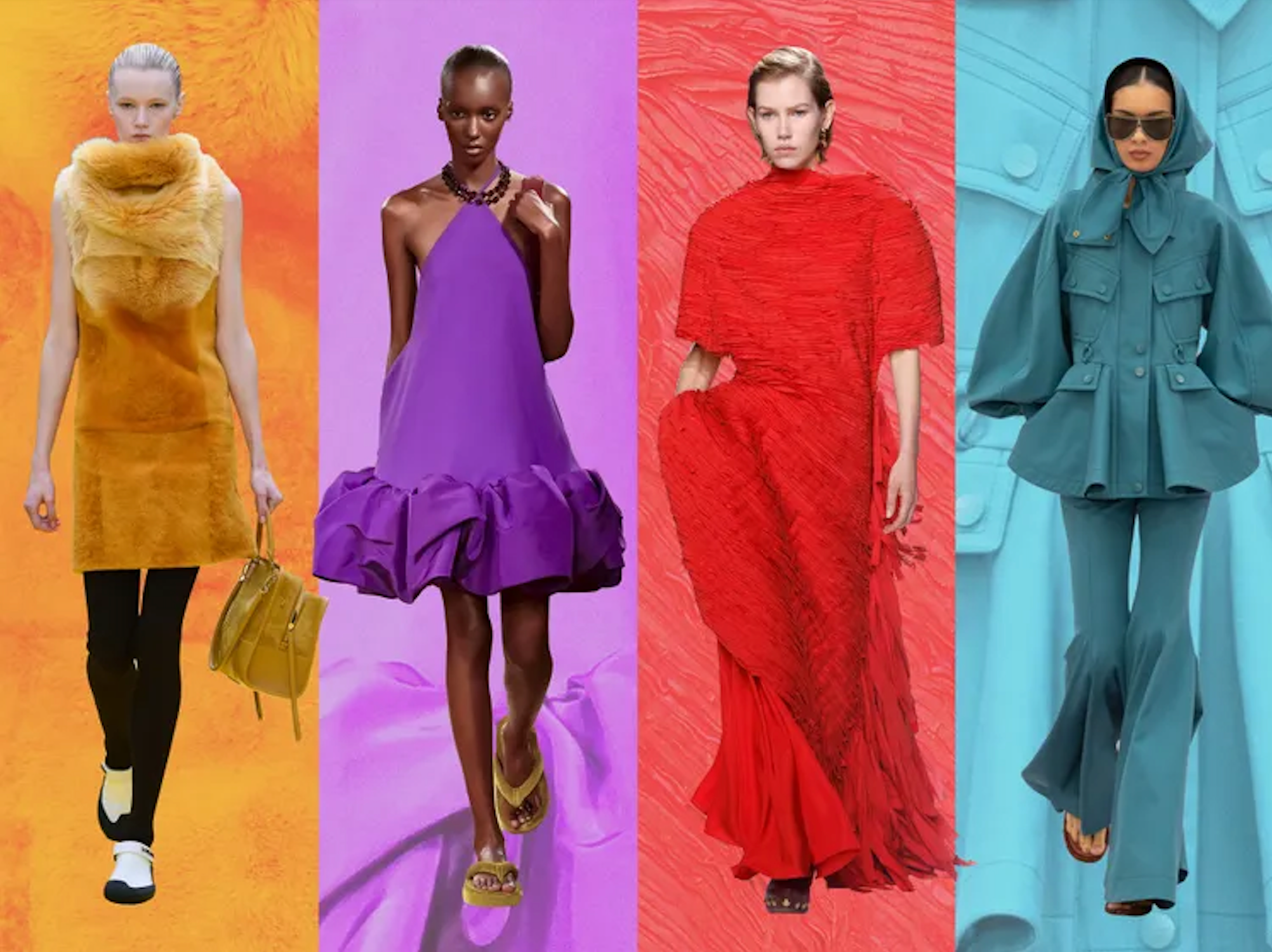
Ahead, discover the six standout spring color trends, straight from the runways.
Royal Purple—Out: Espresso Brown
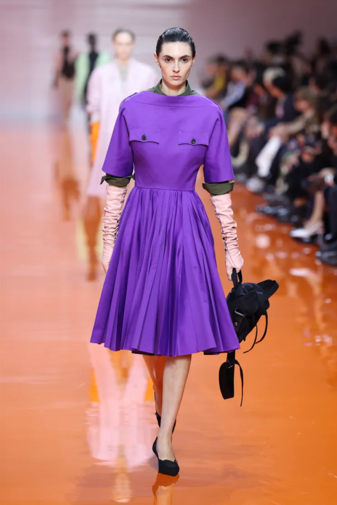
The Prada spring show was just one example of royal purple’s runway dominance–Balenciaga and Valentino embraced the saturated hue just as boldly. This regal shade is surging in popularity for the season, with celebs like Lady Gaga and Jessica Simpson already following suit. Whether you weave purple accessories into your look or go full force, you won’t want to miss out on this divisive trend.
Canary Yellow—Out: Butter Yellow
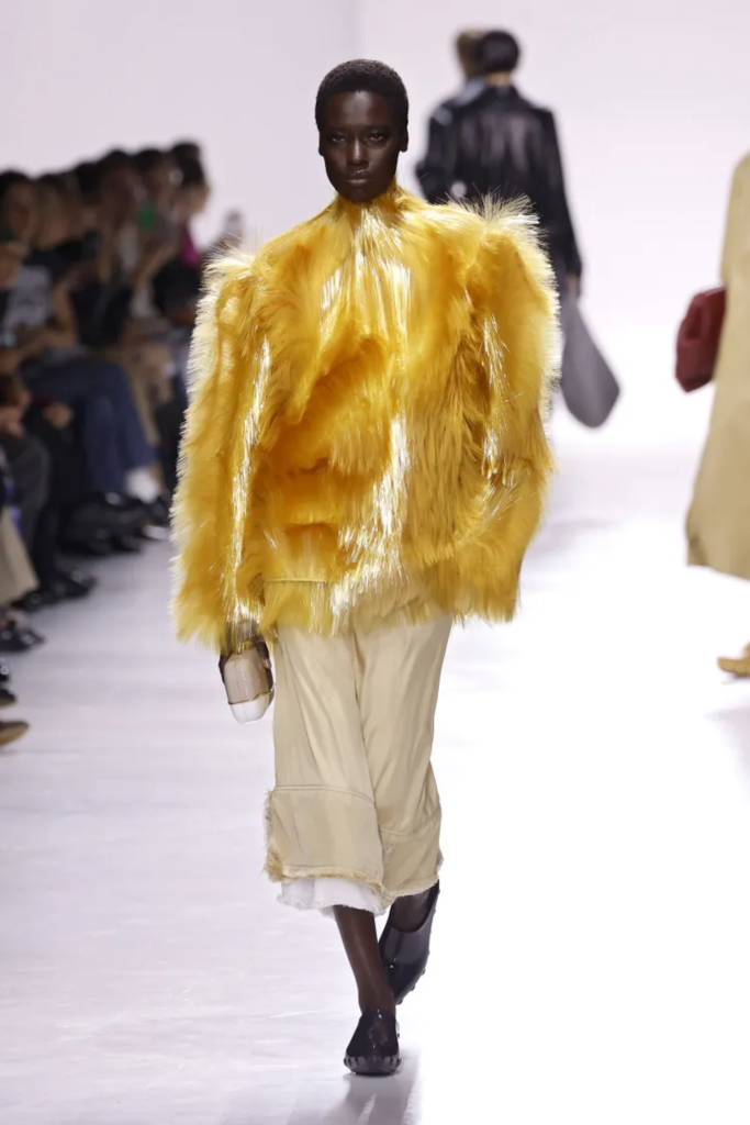
We’re upgrading butter yellow to its bolder big sis this spring: canary yellow. With the vibrant shade popping up on the Bottega Veneta and Balenciaga runways, it’s hard not to feel an instant mood boost. Pair a yellow top with some tonal bottoms, as pictured here, or lean into colorblocking with bold hits of red or blue.
Tomato Red—Out: Oxblood
Tomato red is having a moment on and off the runway. Street style stars stepped out in lacey tights, outerwear, and sweaters, while designers echoed the trend on the catwalk. Spotted at Tory Burch for fall and Bottega Veneta for spring, the bold hue adds an instant jolt to any look. For styling, pair a red sweater over some neutral tones for a pop, or with a soft pink shade for some balance. Some fashion insiders are even calling it… a neutral.
Clementine Crush—Out: Basic Beige
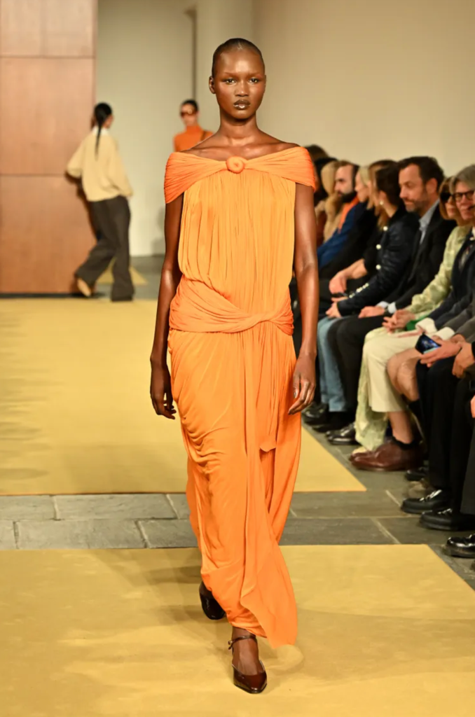
More from the Tory Burch fall runway: clementine orange. Not too far off from red, this zesty shade feels like a fresh take on a renewal for the season ahead–and it lends itself especially well to resort wear (besides Timmy and Kylie’s carpet moment!). After all, orange and sun-kissed skin just go hand in hand in the warmer months. Whether you wear it as a statement dress or opt for a subtle pop of color in your shoes, this is one hue worth leaning into.
Transformative Teal—Out: Mint
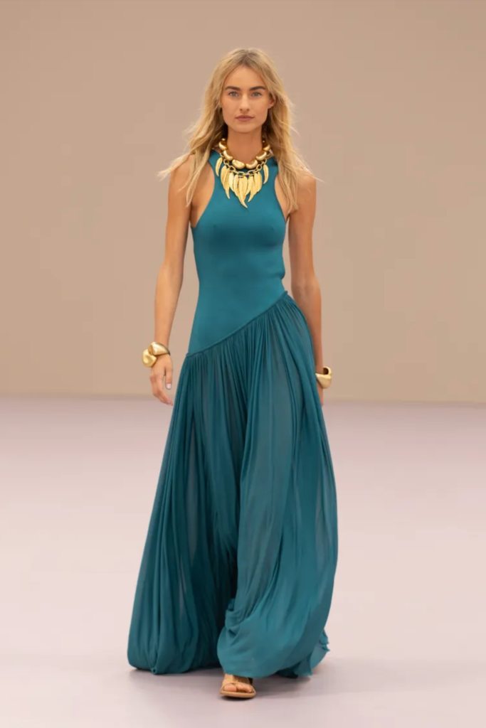
Meet transformative teal–WGSN’s color of the year—and a shade that’s already made its way into the fashion world. Demonstrated by the likes of Zimmermann, Alaïa, and Loewe, teal is emerging as a new favorite shade of blue. It’s even showing up in standout after-party looks, too. Dive into the trend with a full monochrome look, or balance it with complementary pastels like sage green for a fresh, modern take.
Powder Pink—Out: Hot Pink
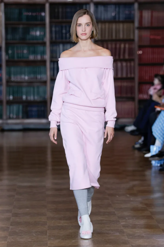
Powder pink is a hue that you can easily embrace head-on. A perennial favorite (blame it on coquette core), it was spotlighted on Sandy Liang’s fall runway, where her playful approach proved that baby pink isn’t going anywhere. Feminine yet surprisingly versatile, it pairs beautifully with shades like grey, red, and brown, making it a wardrobe must-have this season.
By Amanda Le


